

What is technical debt, and why do tech companies often seem to care so little about it? Unfortunately, many software engineers will encounter this ironic phenomenon during their careers. In today’s article, you will learn a visualisation technique that will break down the complexity of a technical backlog into digestible chunks that non-technical decision-makers will feel compelled to prioritise.
What is Technical Debt?
Technical debt, often abbreviated to “tech debt”, is the accumulation of undesirable characteristics in production software. Sometimes, these qualities are self-inflicted; other times, external factors impose them upon us.
Self-Inflicted Technical Debt Examples
Unfortunately, software engineers can inflict technical debt upon themselves at all levels of granularity within their systems.
Self-inflicted technical debt may be the result of failed best efforts. We often make mistakes when trying something for the first time. Perhaps we’re filling in the gaps for a missing team member. This type of technical debt is unintentional.
As strange as it sounds, other times tech debt is intentionally introduced into a system. This is often followed with a common excuse of needing to meet a hard deadline or time-sensitive roadmap milestone.
The engineers and decision-makers who knowingly introduce this type of technical debt are always steadfast in their opinion that care will be taken to remediate any shortcomings once the initial deliverable is released. Knowingly introducing technical debt into a system creates a perilous precedent. This re-work is often never completed, yet the expectation of unrealistically fast engineering time perpetuates this practice until it becomes the norm.
High-level examples of self-inflected technical debt include:
- Poor choice of technology when planning a solution’s architecture
- Complex solution design (footprint), tightly coupled or misused services
- Unnecessarily expensive solutions, otherwise known as throwing money at problems to make them go away
Low-level examples of self-inflicted tech debt include:
- Lack of automated test coverage or poor quality/flakey tests
- Bloated classes with too much responsibility
- A lack of appropriate alerting or telemetry to understand what a system is actually doing
Externally Imposed Technical Debt Examples
It seems a foreign concept to many technology businesses that a piece of software cannot continue running in production without intervention. This fact remains true, irrespective of how little self-imposed technical debt the system may have accumulated.
This is because it takes a village to build even a simple system, meaning that software comprises more than just the code that your company’s engineers authored. Every library or consumed service is also its own product that one or more engineers are working to continually improve (we hope).
The cadence that library/framework authors or cloud providers iterate could be completely arbitrary. Each dependency of your system may require intervention at random times or even short notice. Even if a technology has a long-term roadmap and release cadence, such as Microsoft .Net’s Release Cadence your engineers will, at a minimum, need to upgrade their systems once every 2 years to remain on a supported version of the framework if working with .Net.
For this reason, externally imposed technical debt may impact your system through:
- Libraries and framework dependencies releasing new versions or stopping support for old versions that your systems consume
- Cloud-based hosting providers deprecating products/services/versions that your systems depend on
- Security vulnerabilities being discovered in the above, which require quick remediation to retain compliance for your business
Why is Tech Debt Not Addressed?
How long is a piece of string? There are countless reasons why technical debt may not be fixed:
- It may not be captured as it is found and is then forgotten
- Bugs/problems associated with tech debt may be difficult to reproduce
- The complexity of the tech debt may be high or require special skills to solve
- It may take a lot of engineering time (money) to solve
- Customers may not benefit from its remediation, or it cannot be correlated to a revenue-generating stream
- There are too many small things that don’t fit into broader planning epics because there is no over-arching theme
As you can see the list could go on ad nauseum. However, there’s one major reason why businesses don’t allocate enough time to remediating tech debt:
Non-technical decision makers often do not understand the cumulative scope or impact of technical debt.
If you plan your work in Jira you could have 20 tickets to solve an architectural problem. Inversely, you might have a single ticket to add some clarity to your application logs to help with debugging customer requests.
While the details of any individual ticket may be understood by a non-technical person, they don’t paint a clear picture of the entire system’s health. The cognitive complexity of your entire engineering backlog is likely far too high for a non-technical person to understand, and perhaps even engineers. What parts of the system do those initiatives relate to? How severe is the debt to remediate? How healthy is a system or any of its given components in general?
Heatmaps For Visualising Scope and Impact of Technical Debt
Think of a heatmap as a matrix (like an excel spreadsheet) that contains data in rows and columns. While each cell in the spreadsheet contains data, it also has a colour (or different intensity of the same colour) to visualise something correlated to the data in the cell. This type of two-dimensional visualisation is valuable in simplifying complex concepts.
A technical debt heatmap will capture information about the technical debt within the data of the cells. This may only have meaning to engineers. The colour of each cell can then be used to express the severity of the technical debt. This will provide meaning to non-technical stakeholders who may not understand the data itself and form a great “at a glance” snapshot of the overall system’s health.
Tech Debt Heatmap Conceptual Example
Let’s take a look at a conceptual tech debt heatmap:
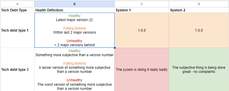
The sample technical debt heatmap was created in Google Sheets. No paid tooling is necessary to capture the required data or convey meaning; we’ll cover other ways this can be captured below.
Column A
This column talks about the tech debt type. This could be anything ranging from objective (easy to quantify) to wildly subjective (someone’s opinion).
Examples of objective tech debt include:
- Version numbers, such as that of a library that is used or a cloud service that is consumed
- Yes/no criteria, such as whether a system meets compliance requirements or aligns with a given technology standard imposed by your business
Objective tech debt measures are a great type to report on as they are concrete and cannot be debated.
Subjective tech debt can include:
- Overall satisfaction with the quality of code for a given system or component
- Amount or quality of test coverage
- Quality of application logging
These types of tech debt may need to be described using sentences. They may also be debated within the team and are more difficult to prove. For example, what constitutes quality in any of these dot points?
The team may like to align on some objective sub-points to help establish a vision for improvement or to help grade associated health. For example, quality code may constitute a cyclomatic complexity of less than 10 alongside a general “vibe check”. Column B metrics could then be based on the culmination of objective and subjective opinions.
Column B
Sets the rules of tech debt evaluation in three categories:
- Healthy
- Falling behind
- Unhealthy
This can include the current version and tolerance for lagging behind it for objective technical debt. This will be a written description of expectations within each category for subjective technical debt.
Remaining Columns
The remaining columns represent each product/system/component on which you wish to report the technical debt. When reporting to non-technical decision-makers, it is often best to keep these high level. Otherwise, you will lose the “at a glance” top-down view of overall health.
Each cell is populated with the relevant data (such as version number or description) and then coloured according to its compliance with the health definition.
Specific Example of a Technical Debt Heatmap
Let’s take a look at a more concrete example.
CodeSloth.blog contains many articles about ElasticSearch and OpenSearch, so let’s pretend that we are working with a product that allows users to search for things (such as an online store that allows users to search for inventory). This product consists of the web API that exposes search functionality and the indexers that populate an OpenSearch cluster with data. An OpenSearch cluster facilitates searching, and API responses are cached in Redis.
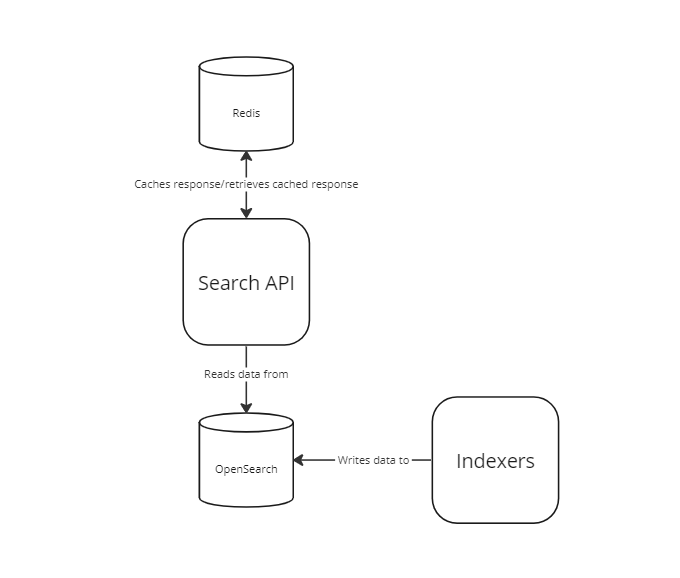
We can now draw an example technical debt heatmap for this pretend system:
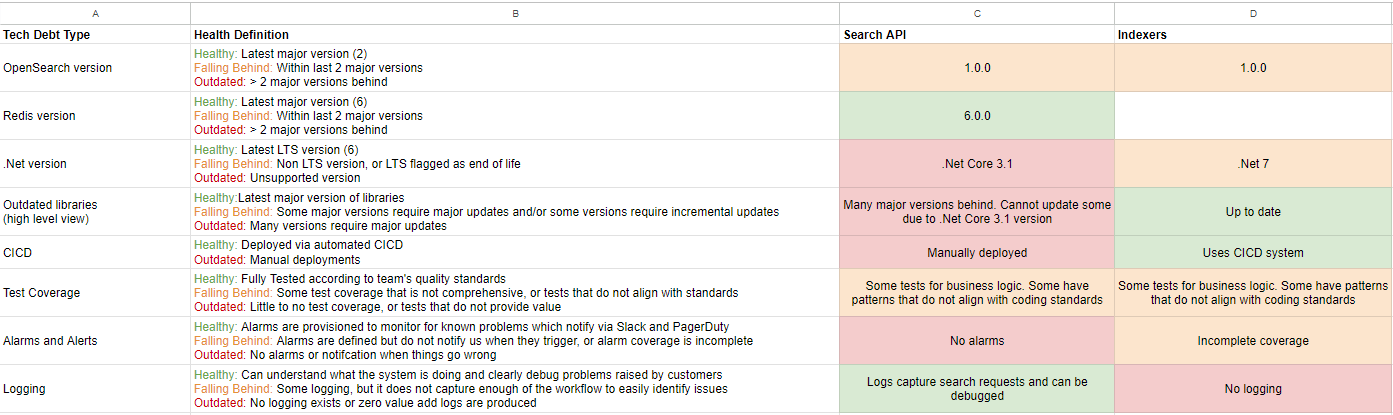
You don’t need to be a software engineer to hear alarm bells ringing at the sight of the red and orange on this heatmap.
How to Use a Technical Debt Heatmap
The top-level goal of the technical debt heatmap is to demonstrate overall system health.
The scope of technical debt can be illustrated to stakeholders by demonstrating the number of non-green v.s. green cells. This can be used to facilitate conversations around enhancing product planning processes to include tech debt remediation as a standard practice, or budget additional time to address long overdue technical uplift for very unhealthy systems.
By speaking to the red/orange rows captured in the heatmap you will be able to dive deeper into only the necessary detail. It is in these converastions that the impact of tech debt can be emphasised. Technical debt impact may correlated to:
- Increasing engineering times for new developments
- Increasing numbers of new bugs being released to production
- Difficulty in identifying the root cause of production problems
By observing the scope and impact holistically, you will also be able to form a conversation around the prioritisation of tech debt remediation work items or epics to ensure that you will deliver the maximum impact as early as possible.
In the example above, if we understood the Search API to be the most critical system of the two, our planning could focus around remediating the broad scope of its technical debt and generally unhealthy state. The heatmap allows us to at-a-glance see the highest impact items such as automating deployment through CICD adoption or putting alerting in place and tackle those first, before moving onto managing library versions.
The heatmap allows us to see that the indexers aren’t perfect, but given they aren’t as critical as the API and the impact of the tech debt is less severe, we can hold off on that work for the moment while we focus our efforts on the API.
This clarity would be very hard to achieve by scrolling through a Jira backlog; assuming all of the technical debt was even logged in Jira tickets to begin with.
How to Maintain a Technical Debt Heatmap
Depending on the number of systems that you govern or the amount of technical debt that you wish to visualise, it may take some time to build your heatmap.
Given the heatmap provides highest value in and around planning cycles it may be worth generating a new heatmap snapshot of your system’s health prior to these cycles; such as once a quarter.
Creating a new heatmap per cycle will also allow you to visualise the incremental improvements to system health over time at-a-glance too!
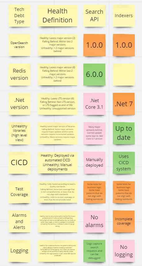
Tech Debt Heatmap Form
The tech debt heatmap does not have to be an excel document. It could for example, be sticky notes on a Miro board
Or even post it notes on a physical board.
The options are limitless, as long as you are able to achieve a clear visual representation of negative health at a glance.
Sloth Summary
A tehnical debt heatmap is a valuable tool for visualising the health of a product/system/service/component. It can take complex backlogs of tech debt and simplify them into talking points that non-technical decision makers can understand at a glance, yet provide a great sprinboard to dive deep into critical conversations about tech debt impact.